

The other treatment I developed was with the M. See I'm a big fan of the M but it usually gets overlooked because of how wide it is, but I like it for it’s downward force. Which is why I really enjoyed the sketch I had with the M where I moved down the two angles some and added gaps to those angels. Not only did moving it down some give this strong v to it but it also creates these two ears that help reinforce that downward movement. So I took that direction and used it in the N and later to the V, W, A, and K.
And well that was basically it for the capitals. Not too shabby considering capital letters are usually boring and utilitarian mostly. Lowercase is where you tend to find the fun in most typefaces. Speaking of which I did have one odd development for the lower cases. For the O, and C I just mimicked what the upper cases were doing. Same for the V, W, L, S and lowercase K really. But here’s where I introduced a new feature. See for the lowercase b, d, u, n, p, q, and g I didn’t want to treat them the same as the lowercase o. I was really digging what I had done with the f and t. Where I gave them an angle at what is traditionally a right angle on those letterforms. There was something about that diagonal gap I liked. I wanted that movement. My previous typeface Piko I had added these serifs to the lowercase b, d, m, and n to help the flow of the letterforms since I was very much into them specifically. So instead of adding a gap on the top and bottom of these letterforms like the lowercase o or adding a gap to the strong vertical like say what I did for capital B, here I add a slight serif to them and get that angle like the lowercase F and T have. So that gave me the direction for b, d, g, m, n, p, q, and r.
This treatment to the lowercases help determine my lowercase a and e actually. Instead of having a traditional bowl I played off that angel in the gaps. Which oddly fell inline with what I was doing with the capital S and lowercase s.
I didn’t want the S to have this spine where the two curves came together. Plus I didn't want to add gaps to it like the O. I was more inspired by what was happening in the capital M, N, K, and X. Where the gaps were placed to accent the angle. So adding the angles to the spine not only gave the gaps purpose but made the S
feel more like the rest of the capitals.
After this class was done I ended up refining this typeface for a while. The gaps needed to
be adjusted many times to the point where optically they felt uniformed. Plus I wanted
to develop two more weights because I was already working on the Delta Poster Series project and I wanted more options.


One of the biggest determiners in the creation of this typeface
was the fact that it was originally created in a class I took at the Letterform Archive in San Francisco. I have another typeface that the origins began in a similar class but that one was developed more on my own after that class than Delta. Before enrolling in this class I had already put pencil to paper on some sketches for what would be the basis of the look and feel of Delta. At the time I was sketching out some ideas for a general direction for what in my
mind would be described as a Sci Fi type typeface.
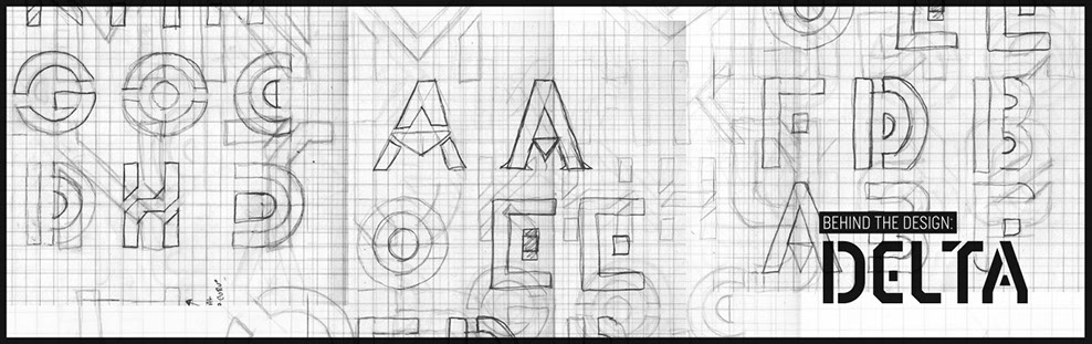
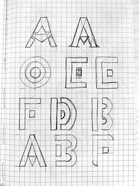
Originally I was just sketching out ideas exploring ways to abstract each letterform. As you can see on some of these early sketches one idea I was obsessed with was adding fills in all the round letterforms. So for letters like O, C, D, and even the P and R, the
other major stylist thing I was exploring was adding gaps or breaks in the characters. I especially liked how it felt if you left the arm of the F broken off and floating. Now that may seem very stencil like but honestly at that point early on I wasn't thinking about making
a stencil. It wasn’t until much later when the whole character set was close to being finished that I realized well shit I make a stencil typeface. But I will get to that much later. Regardless, as you can
see with the E and the F, early on I liked that idea and I even tried incorporating it in the D. The biggest driving idea for me was
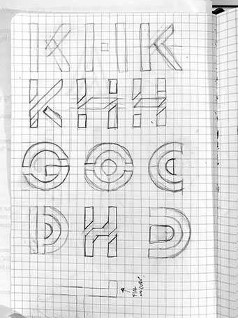
finding interesting ways to add gaps in each character. More specifically gaps in letterforms like K, H, T, and N. That was really
the driving force in creating the look of Delta not only early on but also when I started working in class.
Before I go on I want to talk about this class real quickly here. Like I said, not only did this class influence the design direction of this typeface but also introduced me to a few very helpful things most type designers should know. The biggest (or at least for me) was the introduction of “proofs’ and spacing. Spacing is hugely important to typeface design. If you don't have proper spacing on your letterforms it can create a lot of problems. Plus if you properly space each letterform in theory you don't need kerning pairs. Well you almost don't need kerning pairs. The second thing this class introduced me to was Type Cookers. Now let me be honest I’m not a fan of type cookers. It’s just a personal preference and the complete opposite on how I like to generate ideas. But that being said a type cooker exercise was a factor in how Delta was designed. Part of the class was to present 3 design directions for a typeface based on 3 different type cookers. Now what is a Typecooker? Here’s a definition from LettError.com.
TypeCooker is a simple exercise generator for those interested
in type design and lettering. It chooses randomly from lists of carefully picked parameters, in varying degrees of difficulty (more
or fewer parameters) and complexity. The task is then to draw
letters that incorporate as many of the parameters as possible.
Basically it generates random parameters for you. So say for example you go to typecooker.com. Refresh that page and you
get a new set of parameters. Each refresh gives you a new set
of parameters. We are talking about things like Serif or San Serif, Condensed width or Normal, Bold or Super Thin. Etc etc etc, you
get the idea.
So like I mentioned I had to present 3 rough ideas for a typeface from 3 different type cookers. Well it just so happened one of those type cookers fell in line with the original look and feel of Delta. The only difference was that the typecooker called for a condensed typeface. Well as you can see from my early sketches originally these were more geometric and wider than a traditional condensed typeface. So with that one variation in mind when I started creating this in class I had to lose those early ideas of adding some sort of fill in the more round letterforms. But what I was left with was this idea of finding interesting places for gaps or breaks in each letterform. And that was basically the biggest driving point in designing Delta.
From my early sketches I like the ideas I had for the
E and F with the floating arm so I kept that. I had sketched out a B from earlier and I liked having a strong vertical bar with a gap for the two loops off
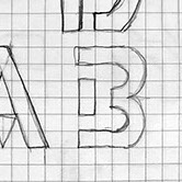
to the right. This treatment helps decide what to do with the P, R, and D. Since letters like O, C, G and J, have so much curve to them there wasn’t any place to add a gap that felt right so just splitting down the middle seemed the best choice. I had some early sketches for the H most of which seemed like they weren’t working and I was very much opposed to treating them like how the B and P were in terms of just giving the horizontal bar a gap and letting the verticals shine. Seemed boring and predictable. I had a sketch where I added a diagonal to the crossbar and added gaps to it that gave a usually straight forward boring H allot more movement and intrigue that I was digging. The great part about that decision was it brought more personality to many more characters.
Here’s what I mean. A traditional H would have had two gaps on the cross bar. But adding those angles makes a very right angled character more interesting. Now I have a personal rule that when I find a new or interesting way of treating a problem, I like to try and mimic that in at least one other letterform. I find it annoying when one letterform is treated one way
and that treatment doesn’t show up on any other letterforms. So with that in mind, since I got rid of right angles on the H and then I take that same treatment and apply it to the E, F, L and T. Not only does that give the E and F more character but also gives the T more personality than the boring ho hum one vertical and one horizontal typical rendering of it.

Behind the design :
Delta