

doing it right
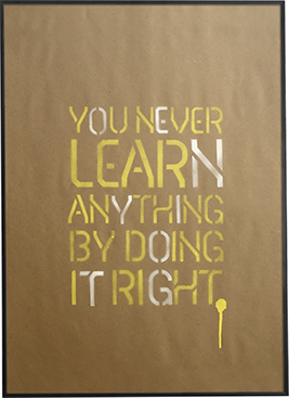
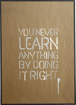

Doing It Right, was the first of the Delta series I started working on. Playing with two colors in this version I realized early on getting perfect alignment when matching up the individual color stencils was going to be challenging. So instead I leaned into it for all these posters. Offsetting each color slightly more just to create some tension. I also added this paint drip at the end to play up the imperfection of the whole progress.
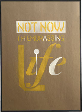


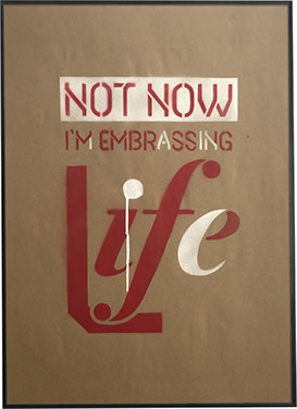
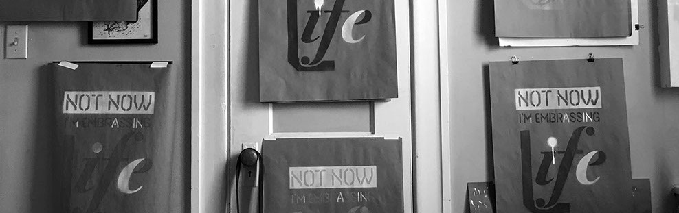
not
now
Not Now is the second exploration in this series. Similar to the Doing It Right where I’m using two colors and offsetting each stencil. But with this version instead of choosing whole letters to choose for the white color on this one I started only using parts of whole letters. This was also the first time I overlay colors on top of each other. For example the words "not now" overlaid onto the white.
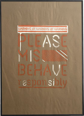
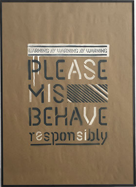
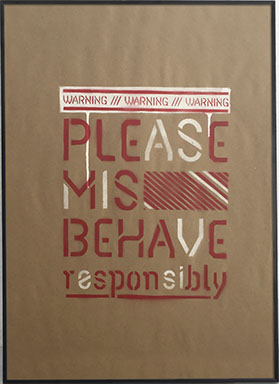
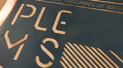
Mis Behave
Mis Behave, is the third in this series and once again building
on the previous two posters I expanded the way I treated this one. Like previous ones using
two colors, adding drips and overlapping colors. Only for this one I started to incorporate some graphic elements like diagonals you see here, as well as a second message like the phrase “warning”.


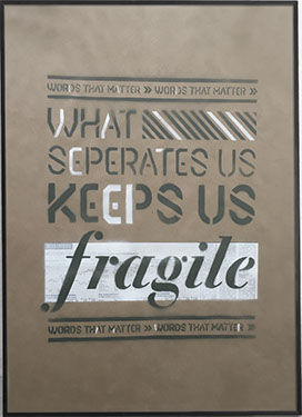
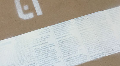
What Keeps Us Fragile
Much like every previous version of these Delta posters I added something new for What Keeps Us Fragile. In this version I explored adding more texture with the introduction of using newsprint. For these posters I took cropped out sheets of newspaper spray mounted it to the kraft paper and gave it a light coat of white spray paint. Then added a color stencil overtop of it.

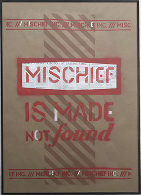
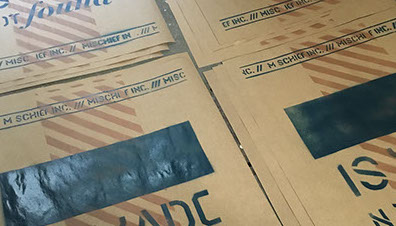
Mischief
The last of these Delta posters on kraft paper Mischief is using all of the different features of the previous posters. For this one I want to add a third color, this brown that comes close to the color and texture of the kraft paper. Using it for those diagonal graphic elements helps give those elements and the poster in general depth and an added twist.

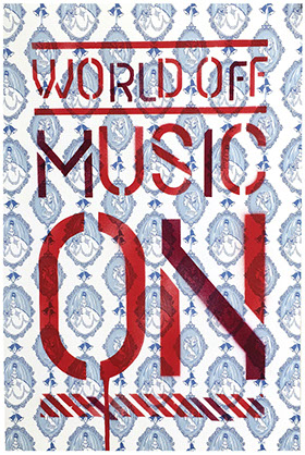

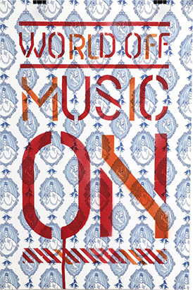
music on
Music On is the last version of these Delta posters. A year before this project I had done some silk screening on these sheets of patterned paper I had bought from French Paper Company. They were just laying around and figured I would try seeing if these stencils would work on them. One of the more simpler layouts I did in this series but still with the same treatment as previous ones.