


Behind the design :
I first started creating typefaces in late 2017, beginning with the typeface Racer. If you’ve been reading about some of my typefaces on here my, you’ll know that I created Racer out of necessity. Since then I have taught myself how to design typefaces mostly from trial and error, a few classes, and a few books. Between that time and now I have created ten more typefaces, Ponti being my latest. Over the years I have refined each of them as I learned from my mistakes or developed a better eye. With every new typeface I created, I felt
a desire to share and showcase what I’ve been creating. To be truthful, only a handful of people have seen all my typefaces, mostly because it was a personal hobby and something I wasn't looking to get rich or famous or have any fanfare about them. I honestly just enjoyed the journey I was on, learning and creating. A lot of my typefaces are centered around some idea or exploration that inspires me and I kind of get obsessed with seeing how it will work out: half creative exercise, half puzzle.
That being said, every so often the idea of putting them out there and promoting them has crossed my mind. I had a website for them similar to this current one, but once again I really didn't share it out with many people. Occasional the thought would cross my mind to create an Instagram account for them. BUT that idea usually faded very quickly because of two things. An Instagram account seemed like a feasible way to share my typefaces, but there were two main reasons which stopped me from doing so. First, I was enjoying the journey of exploring this part my my creativity, and not interested enough in sharing them in a meaningful way. Second, the thought of creating actual content for an Instagram feed did not appeal to me—I worried it would be boring and time-consuming.
Let me explain how I viewed this a little more. When creating content that will or should showcase a typeface, there’s very much a "standard" way of doing so. If you search the hashtag #typedesign I would say about half of the posting looks like this…

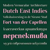


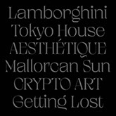

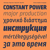

There are a lot of reasons for this. For starters, when showing off
a typeface, a neutral presentation will allow the beauty of the characters to stand out. Plus, if you're selling them, you don't want
to pigeon hole them into being used one way or another. You want to keep it open to as many possibilities as possible, hence why you see so many “type samples” the way you see them above. Keep them simple, neutral and hope that each typeface speaks for itself. It's the way it has always been done and most likely will always be the way it’s done.
But that’s always been a big stumbling block for me when thinking about creating any sort of content for my typefaces. I honestly loathed the idea of it, so I just didn't do it. I needed a hook, an idea, or some sort of concept if I was going to do anything with my typefaces.
Which brings me to this Instagram project! Late in 2019 I went to what I think was labeled a garage sale at the offices of Jessica Hishe and Erik Marinovich. They were clearing out their space and selling their belongings to the public. Being a fan of both of them, I swung by to see what was to be had. As I strolled around I found this amazing French book called Typoesie, by Jerome Peignot, which is a collection of works from typographers of the 20th century. A collection of works from typographers in the 20th century. I have attended art school, graphic design programs, and countless lectures; I have taught classes and have been a designer for over fifteen years. Because of the many exposures I’ve had in the design field, it is rare for me to find something in the field that I haven’t already seen in some version or another.
But in this book I found some new inspiration for what I envisioned was a way I could showcase a typeface. There were a couple pieces by Emment Williams, one by Pierre Garnier, and another one by Ilse Garnier, his partner, that really spoke to me.
At the core what I saw were these people repeating letter forms over and over creating rhythm, texture and movement and to me I saw that as a unique way of showing a typeface.
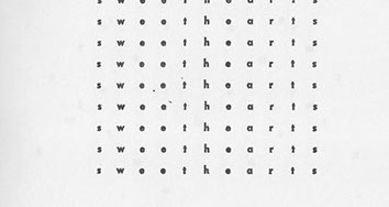
For example, Emmett Williams’s Mediation No 2. Uses the whole alphabet with A at the center, Z at the corners and all the letters in between radiating out. What I love about this is how the repeating letterforms create this diamond pattern within the square composition. Another example is his Sweethearts piece. There’s something to the spaced out characters that fit inside this square shape that made me think this could be an interesting way to showcase certain letterforms.
The repeating of letters creates texture and patterns. Something about showcasing one character at a time appealed to me, and I felt that I could use this technique to highlight some of my typefaces. Similarly, I was drawn to Ilse Garnier’s Corrida display because of the striation in the hex shape created by the repeated capital R.
So with those nuggets of inspiration I started exploring a few different ways of displaying my typefaces or more specifically characters with my typeface. One of the things I started exploring was movement.
For example, on the Delta type sample. The strong downward diagonals of the N and K create movement opposite of the upward gesture of the A. The same can be said about the Falcon SR sample. There I'm playing with two downward diagonals in the N and Z, then further highlighting the strong downward diagonal of Z with a bolder weight. Not only does this highlight a character, but also using the different weights that typeface to brings more attention to it. It's an added wrinkle that starts to bring to life some of these explorations. In the Falcon SS sample with the word VISA, you can see once again this playing off the movement of the V and A but really showcasing it by using the heavy and light weight of that typeface.
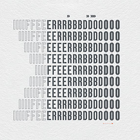
Another avenue I started going down was how letterforms can relate or mirror one another. Simple ideas like how the lowercase B, D, P, and Q relate to one another. Then exploring the rhythmic nature of pairing them all together like in the Falcon SR sample below. This is the same idea I started exploring with the Blockhead sample. There I’m looking at how the F and L relate to the E. But in this piece I'm taking advantage of the different styles in the Blockhead typeface to highlight that relationship. Utilizing some of the styles on my typefaces to help visually show these relationships came in very handy sometimes, like in the Racer sample below. Using three of
the four styles available in that typeface to show the relationship between I, F, E, R, B, D and O.
Then there’s a whole other offshoot of
using palindromes as a way of showcasing letterforms.
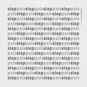
Palindromes: A word, phrase, or sequence that reads the same backward as forward.
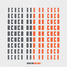
Using palindromes can highlight a typeface by using repeated characters, creating texture and rhythm, and, in some cases, different styles of the typefaces. For example take the palindrome PALS and SLAP. I used that for an exploration with my typeface Ruins, shown to the right. It plays with texture and rhythm, but at the same time is a fun way to show off the oddly designed lowercase P in that character set. Another way of using palindromes is in the sentence Never Odd Or Even, where NEVEROD spelled in reverse order-DOREVEN-completes the sentence, repeating it over and over in different weights like I did in the Ponti Sample. in that example I'm showcasing the different weights and controlled set of characters. Another example of highlighting styles can
be seen in the RACECAR sample. Having the
E in the middle of RAC and CAR is a great way
to showcase the styles in Racer.
There are many different offshoots from those core ideas I started to explore, and you will
able to see once I start sharing them on
this Instagram account. A lot of the type explorations revolve around those main
ideas but I also mixed in some less conceptual explorations and some wordplay or expressive type. But there’s one last idea I had that I am really excited about.
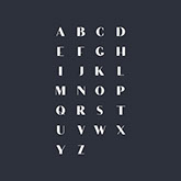
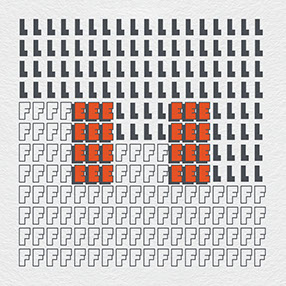
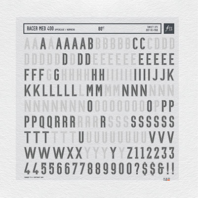
If you don't know who Chris Ashworth is then shame on you. First, if you're a designer reading this then you should know design history. Secondly, you should follow his Instagram feed. He’s been doing these great type sketches that are worth a follow. A lot of his sketches are built off using Letraset type. For those of you who don't know what Letraset type is, see the image to the left. They are basically a sheet of vellum with rub downs on them. You rub the letters you want on whatever surface you desire. As a designer or even as a type nerd Letraset type is catnip. Something about them I always found cool. Plus I always thought they were a very cool way of showing a typeface's full character set. So going back to the issues of finding interesting ways to showcase your typeface I thought that doing something similar as how the Letraset sheets are laid out would be interesting. But what I always found charming in these sheets was when I found them half used. I want that same used feeling in my layouts. The only problem in the past when I tried to mimic random, things like removing characters from a sheet of Letraset, it never actually really felt random. There needs to be some purpose to the missing characters.
That brings me to this one idea I had that I'm very
excited about. For each one of my typefaces I created a mini version of the Letraset sheets for this Instagram feed. You're going to see one slide with all the capitals and one slide with all the lowercase, just like a Letraset sheet. Each one will have what appears to be a large amount of random characters missing. But in fact they aren’t random missing letters, they have a specific purpose.
So why am I doing this? I wanted a new way to display my typefaces and have some fun with it. For each of my current typefaces (minus Racer, since we’ve already used that example), over time I will share slides in an Instagram post using the Letraset method I’ve detailed above: one slide with uppercase letters missing characters from a movie quote, and one slide with lowercase letters missing characters from the names of the actor and movie character. The third slide will display the numerals for the typeface (more on that in a minute). Once the typeface has been shared in this manner, the first person to DM me with the correct quote, correct actor, and correct movie character will receive FREE downloads of all eleven of my typefaces. There will be no runner-up prize, simply the first to get all three answers correct wins the loot.
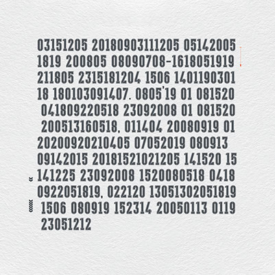
If you have any difficulty deciphering the quote or names, the third slide of the given typeface will show a simple cipher code using numerals of that typeface (see image below). A = 01, B = 02, C = 03, etc. Deciphering these numbers to letters will reveal a brief plot summary of the movie from which the quote was taken.
Using the Days of Thunder example here's a plot summary:
"Cole Trickle enters the high-pressure world of Nascar racing. He's a hot driver with a hot temper, and this attitude gets him into trouble not only with other drivers, but members of his own team as well'"
You can see below the slide with the numbers and next to it is each line with it's corresponding letters. Think of this as a bit of a hint if my purposed Letraset sheet gets too difficult. Plus it’s a very cool way of showcasing each typefaces numbers: visually interesting and useful.
So there you have it, what to expect from my Instagram feed.

Here’s what I did. I have found one fairly popular movie that would relate back to each one of my typefaces in some way, shape, or form. For the example above I used the movie Days of Thunder for the typeface called Racer. Racer, a movie about race cars, see the connection? I took a memorable quote from that movie and used it to dictate all the missing letters on the slide that has all the capital letters.
For example, see the quote off to the right.
"No, no, he didn't slam you, he didn't bump you, he didn't nudge you... he rubbed you. And rubbin, son, is racin'"
This is a quote from the movie Days of Thunder and it's said by Harry Hogge, played by Robert Duvall, I used that quote from the movie to dictate which characters are missing from the slide that has all the capital letters.
Then for the lowercase slide I took the actor's name who said that quote in the movie, and his character's name, and used those letters as the ones I removed from that slide. Once again, see the example above. The missing characters come from the names of the actor and character from the movie.


» FOLLOW «