


So just like that, I was off to the races with my first ever revival! The uppercases didn't take that much time to develop but the bigger issue was building out the lowercase letters. Once again I had plenty of reference letters to at least get me started since letters like C, O, V, W, X, S, and Z were all just shorter versions of their capital versions. Plus at the very least I had the capital K which I could easily create a lowercase version of more or less the same way. Plus I had the capital E and F to base the lowercase L and I from.
So that gave me almost 10 out of the 26 lowercase letters I needed to create. With the lowercase O already done, I had a good idea what to do with the lowercase p, q, b, and d. Plus with those lower cases in place I had enough info to create the arch for the h, n, m and even the lowercase u. So out of the original 8 that were the same as their capital letter counterparts more or less I now had 8 more characters I could reference from original letters. Which brought me to 18. 18 out 26 is a pretty great starting point.
Out of the remainder 8 that where left, the lowercase Y could be developed from the lowercase V. Same goes for the J when referring to the lowercase I. Since I did a two story lowercase G, the O was very helpful in developing the upper half. The A and E lowercases were developed from lowercase O and D. Finally for the lower case R, you can reference the lowercase N or H, the same goes for the F.
Lastly, I took inspiration from how I handle the lowercase J from the T. Overall not too shabby I must admit. From 20 original uppercase letters I developed a full upper and lowercase character set. Outside of the lowercase A and E which still to
this day I'm not 100% thrilled with, I have to say it's a pretty consistent typeface.

I'm not sure what drew me to it originally, like
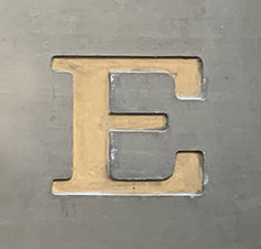
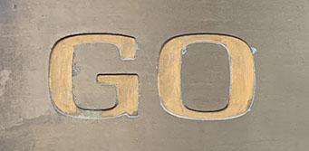
I said, I had walked past it a hundred times before but the more and more I saw it, the more I started taking notice of the typeface it was using. There was something about the O, C, and G in their shapes that intrigued me. It was more boxy then a traditional serif typeface. Plus the actual serifs on the C and G were something different than I had seen before. They were heavier and more pronounced to me than I expected to find. Then oddly for such a traditional typeface, there were no right angles on the corners of any of the letterforms. If you looked closely at the T, E, and H. All of them
had slightly rounded corners. regardless to say I really became infatuated with it. So for the next few months, I walked by this plaque and
I would linger and study it just trying to figure out why I was so drawn to it. Eventually, I took some photos of it, traced a few characters, and used MyFonts.com's WhatTheFont app to see if I could identify who made it and maybe check out the full character set.
Long story short I couldn't find a match. But
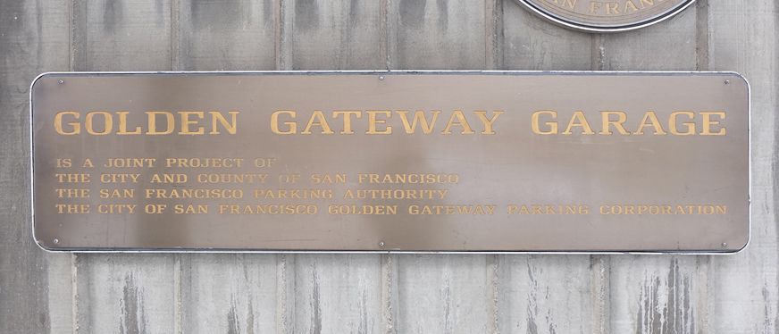
the more time I spent time with this piece of signage, the more I really loved the typeface it was using. So at some point, I was looking over the signage and I figured, well I have 20 of 26
of the capital letters already in this plaque, and the letters I was missing (IE: B, M, Q, V, X, Z) where characters that I could take reference from other existing characters to build out.
The B and the Q were the easiest since you could reference the existing P and O. I had no reference for the tail of the Q, but tried to mimic the serif of the C and create a tail from it. The
M and V I could use the N and W for basic direction. The X was based on the thick and
thin of the Y, and the Z I took direction from
the E or F and general angle from the N.
Behind the design :
Oldboy
Oldboy if I recall rightly was the 5th typeface I had ever created. It has the least amount of ideation of all of my typefaces. There's no
deep creative intrigue like Piko where I was exploring curves or like Blockhead where I wanted to build something with a specific purpose of being layered. This typeface is more of a revival than anything
else. The story behind it is that I was freelancing at a company for
a few months in downtown San Francisco near the Transamerica building. If you know that area you know only a few blocks down
are plenty of parks and outdoor areas along the waterfront. So
almost daily during my lunch break, I would walk down towards
that way. Every so often I pass by this entrance to an underground parking garage.
It wasn't a place I was unfamiliar with since I had been living in SF
for more than long enough and had walked past it a hundred times before. Walking past it almost daily and combining that with me just starting to understand and really get into typeface design I noticed this plaque out front near this garage's entrance.


One last development about this typeface, oddly it came a few years after I finished OldBoy. I was on my way to something near that garage and since we were driving we decided to park inside it. Once we were parked I realized very quickly that all the directional signage inside was the same
typeface used on the plaque out front. I had never thought about looking inside the garage for any more references when creating it yet if I did i would have realized one important thing.
The typeface used on the plaque was either an alternate version of the one used inside or whoever created that plaque actually rounded all the corners on the typeface!
Let me explain a little bit here. So like every underground garage you have larger letters labeling sections so you can find where you parked. And much like any garage there’s signage for where the stairs are, what level you're on etc
etc. Well all that signage is in the same typeface as the one on the plaque. YET on all these directional signs they all have squared right angle corners, which is the opposite of what was on the plaque I used for direction of OldBoy.
Now I know literally nothing about how one creates a plaque like the original one I used as reference, but the only reason
I can come up with to round the corners on that typeface
is that it possibly has something to do with the tension
with fitting them in with the right angle corners causing problems? I really have no clue, so if you know of a valid reason please reach out I’m curious to know why one would round the corners or is it just an aesthetic thing?