


What I did realize pretty early on through
was I wanted a non stencil version of this. But after the failed exploration of bridging the gaps like Peristyle, I knew I didn't want
to just add a straight line across and call it
a day. The stencil version felt very cold and unwelcoming. I wanted to add a friendlier feel to the typeface and break out of the ridged modular feel it had. The only opportunities I found to achieve this idea of adding warmth was on a few characters. For the most part, the way I set up the stencil, you just had to add a straight line to connect the pieces of the characters. But I found on letters like B, M, N, P, R, and W there were opportunities to break out a little. Instead of just connecting them the same way I had for all the other letterforms, here I made the curve on the outside a bit more drastic and over shot it some. For the lowercase I found the same opportunities in the letters b, d, h, m, n, p, q, u and w.
The last bit of inspiration for the design direction for Ponit oddly came from the lettering on top of a store front a few blocks down from me at my old place in San Francisco. It wasn't anything special and truthfully awkwardly done for my tastes, but after I had made the non stencil version of Ponti, the lettering on the top of the storefront reminded me of the P in Ponti. There was something about this lettering that made it easy to create a version of Ponti in an Italic. Maybe it was the lowercase I? But what I decided to
do for this style was add a new wrinkle and modify
the teardrop.
Case in point, look at the lowercase k, now look at it
if I just tilted it forward a few degrees. The teardrop gets all weird and bloated and there’s no flow to the letter at all. So I decided for the Italic I would modify the teardrop with a bit more movement and flow. With those adjustments in place for the italic, it was only natural to make a stencil version of it as well. So
there you have it, 4 styles in this modern modular Italianish typeface.
The other built in feature of Ponti is it comes with a handful of ligatures. Odd for a modular typeface I suppose but since I made the spacing on all these letterforms so tight, I built in more than the normal amount of ligatures. For example, you have your traditional fi, ft, ff, fj, and fl ligatures, but I had to
add an additional fb, fk and fh. Plus, since my lowercase g was a bit nontraditional and the lower portion of it is longer than upper body, I had to make
a few ligatures for when it's paired with the lowercase y or possibly a j or p. For the sake of rhythmic spacing, I thought it would be wise to create a TT ligature for words like LITTLE.
So there you have it, PONTI.

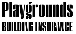
Behind the design :
Ponti
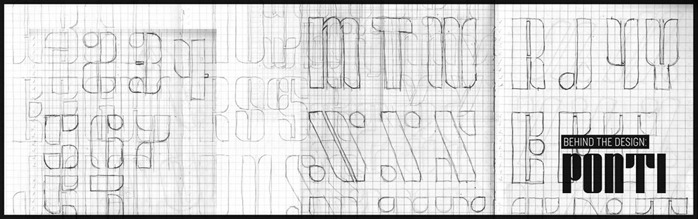
So for a number of years now I have been carrying around a few notebooks with me. Mostly these are for general notes or sketches but I have one specific notebook that I use for developing sketches or ideas.
I also have allot of scraps of paper from print outs or little pieces of printed design I have stumbled upon every now and again. The reason I mention this is that
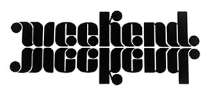
I had this beat up printed out piece of paper with the word Weekend on it. There was something playful about that word I liked and whoever created it, I was loving how they played with these circles in the letterforms.
I also liked the weight of it and the very narrow negative spaces inside the characters. But I was still obsessing over the circles and the general shapes used in this piece of lettering.
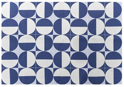
A year or two before I started working on Ponti, Hoefler Co. had released Peristyle and I was crazy for its stencil version. So what I was thinking to do with Ponti was create a stencil typeface that was modular out of some basic shapes. I was inspired both by this scrap piece of paper I had been carrying around in my notebook with
a node to Peristlye. I thought to use what I’m calling a teardrop shape (i.e. a circle with a corner) and then some rectangles shapes with the same curve and
build out this stencil idea, adding those features that Peristyle Stencil had. Btw, "features" mean the way they treat the gaps and how those gaps alternate
from one side to the other. With that said, that is the original inspiration behind the intended design of Ponit.
Speaking of Ponti as a name I choose for this typeface, it was named after Giovanni "Gio" Ponti. He was an Italian architect, industrial designer, furniture designer, artist, teacher, writer and publisher whose career spanned six decades. I was unaware of who Gio was before this but I did stumble upon some of his patterns when working on this typeface. One specific pattern
of his very much represented the elements I was using. Plus when I started learning about Gio Ponti, I was already pretty far along with his namesake typeface and it already had this Italian feel to it. So it felt
natural to give Gio a nod by using his name for it.
Like I mentioned before, the original intent for this typeface was to build a modular stencil using the teardrop shape, rectangles, and a few rectangles
with a curve on one or two corners. Plus maybe
add in the same features Peristyle had in its stencil.
Building out the letterforms wasn’t that hard. I had a
few problematic letters to work out but every typeface has that when designing them. But overall I was digging the look and feel. I tried out that Peristyle feature and had been sitting with it for awhile until i came to the conclusion it didn't seem to fit the overall design. Because it had so little negative space inside the letterforms, the stylistic feature never really added anything to the overall aesthetic. In most cases it honestly muddied things up too much. What I was left with was this very modern modular, a bit retro typeface.