


The Poser typeface is exactly what its namesake says it is. But for those of you not fluent in 80's slang here's how Urban Dictionary defines the word Poser as the following:
POSER:
A poser is someone who tries to fit into a profile they aren't. People who try to give off the impression that they are one thing when they are really another. Also, a poser can be one who says they can do something that they can't. Or more commonly, a poser is someone who, when doing something successfully, takes more than enough credit for it.
There's a lot of types of Posers, for example The guys who hang out with skateboarders but can't actually skate, even though they have
a board.
For a long time now I have been a fan of graffiti in all shapes and forms. Whether it's guys like Shepard Fairey or Erneto Yerena to the people at 123 klan or just lettering artists that draw in that type of aesthetic. Plus I’m just a sucker for anything that has a thick stroke around it with paint drips. All of which brings me to the Poser typeface. I had recently been very into hand drawn lettering. I had found myself following and liking a lot more artists whose hand lettering is in this graffiti aesthetic. Meaning big bold outlines around their type and of course paint drips. I had been looking at them so much that I have become infatuated with a certain little detail I’m seeing in all of these. To be specific what I was infatuated with was this little detail on the inside of the letterforms that creates this illusion of the stroke of the letterform overlapping.
It's this detail that was the basis of why I created Poser. What I wanted to do was create a layered typeface that brought the same aesthetic that some of my favorite lettering images had. I wanted big thick strokes, paint drips and this little but very cool detail. On a side note and for all you type nerds out there, this so-called “very cool detail” is actually called a spur.
Now I had made a layered typeface before with Blockhead, but that typeface was designed specifically for layering. As much as I enjoy the look of that typeface it’s pretty generic. That was mostly because I was more focused on creating a layered typeface then actually having any design aesthetic I was trying to achieve.
So with that being said, I knew I needed at least 4 layers for this typeface. The first, being the base or what I'm calling Solid. This is going to be what each layer will be either layered on top of or below. The second layer will be the Outline. This will have a thick stroke to it that will surround the Solid layer and have that spur detail. The last two layers are a second thicker layer that will sit behind the Solid layer and those either come with paint drips or without. These I’m calling Bkg or Bkg Drip. Short for background or background with drip.
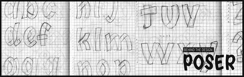
If you look closely at the samples of lettering above, one thing you will notice is that those spurs sit at the corners of each letterform and that each letter has this detail at least once. For most letterforms it's pretty easy to find an area to incorporate this spur, but for letters like O or C that are traditionally so round that there's no opportunities for such detail. That was one of my first problems to solve to actually create a typeface that matched the aesthetic I wanted. To solved it, I decided to pinch all the more traditional round characters.
Outside of the four styles you can use for this typeface and the pinching of the top and bottom of the rounder characters, the other design detail I wanted to put in was having a bouncing baseline. Since I was actually making a typeface and not just a piece of hand drawn lettering, getting that hand drawn impression to it is usually hard since everything is so uniform. Adding a bouncing baseline was one way to actually give this some sort of relaxed, less regimented feel.
The other problem with making a typeface that is intended to mimic hand lettering is when you type set words like LITTLE or FOOT or KISS. The problem is the repeating of individual characters. Take the word LITTLE. You have the L and T repeated twice. The problem here is even though you rendered your typeface in ways that look very hand drawn, when seeing the same character near each other it ruins the illusion. When you actually hand write a word like LITTLE, your L's and T's aren't going to be 100% the same. It's human natural that
each one is slightly different, yet the same. But with
any other typeface you're using the same letterform over and over. It's regimented and uniform which is
the complete opposite of hand lettering.
To help resolve this inherent issue I packed Poser
with 32 alternative letterforms. I tired to focus these alternates on characters most commonly used in the English language. This isn't the prefect fix but it helps the end user get much closer to that hand drawn look
and feel.


:::::::::::::::::::::::::::::::::::::::: DISCLAIMER :::::::::::::::::::::::::::::::::::::::::::
I’m a lover of all things hand made. From furniture, to art prints to hand lettering. And as much as I like this typeface you're never ever going to
get the pure unique quality of hand drawn lettering. So if you need a
piece of artwork for whatever your project and you don't have the time
or money to get something done hopefully in a pinch Poser can bridge
that gap for you.
BUT! If you do have the money and time, support your local artists!
Behind the design :
Poser