


What I wanted was a stencil typeface that brought a sporty feel to the poster series I was working on. F1 in my mind embodies sleek, modern, and fast. Plus, for the way I wanted to use
it, I need a stencil that feels the same way with movement and attitude. So after a few days
of searching and not finding anything to my liking, I set out in making a few letters in what I envision I needed. One of the first things I wanted to incorporate was stripes or at least a stripe. Let me just say this, stripes are dope and racing stripes are bad ass. There are few things in the world that are visually universally recognizable than a racing stripe. Plus adding
a stripe to anything it inherently makes that thing look faster and cooler.
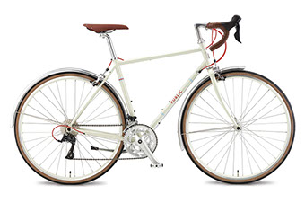
Case in point the bicycle company Public Bikes. Pretty standard bicycles at first glance but the added little details of adding a few stripes on the bike is an instance plus on the cool factor. Another classic example is this jacket from Birdwell Beach Britches. Look at it, pure cool.


Behind the design :
Racer
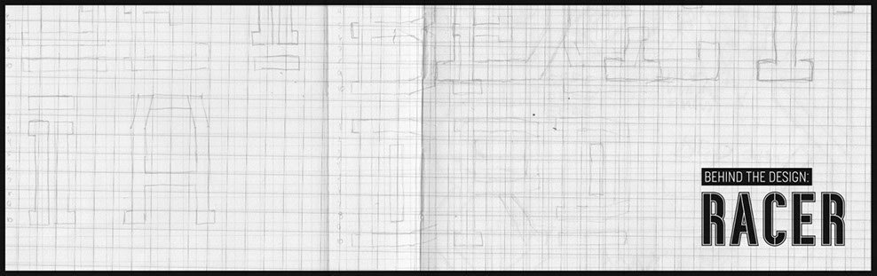
Racer was the first typeface I had ever attempted to create and at the time typeface design in general wasn’t anything I was curious about. In fact I knew little to nothing about the process or anything to do with the software. It was totally built out of necessity actually.
Let me explain, back then I was really into
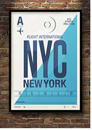
the idea of creating a poster series, it was somewhere around 2012ish or earlier that I had seen a series of travel posters by Illustrator Neil Stevens. You have probably seen them around since then, they have spawned many knockoff versions floating around on Pinterest or Etsy. Regardless I was myself inspired to create something similar (which you can see in my poster section). But back then when I was first starting out with all of this I was working on an idea of a series of posters that highlighted all the Formula One tracks. As I was developing it and exploring ideas I was growing more and more disappointed with the type of stencil typefaces out in the world to choose from. At the time I wasn’t following any independent or small type foundries so I mostly looked on places like MyFonts.com. Most of what I found was stencils that looked to be best used for some sort of Sci Fi B Movie that involved the military or your more traditional ones that looked like it's best use was for a highschool sports team.
As far as types of stripes go, the most common type is the classic two thick lines stripe. It's a classic but I prefer the two thick with a thin line in between them. I like how the contrast of weights plus the thin line gives you a nice bit of added detail. Regardless when thinking about incorporating a "stripe" into a typeface, going the opposite direction with three stripes where the middle one is extremely thick and the two outside ones are thinner seems like the best course of action. The middle thicker stripe can be used as an anchor and give each letterform some weight and definition and the outside thinner stripes act as details or accents. You may not get
the traditional stripe look and feel from it but it does make them all sporty. The other decision I made was not leaving them open ended. Capping gave them a more finished
feel and also fix some problems when stripes intersected.
Speaking about intersections since the basis of this design was a strip, I decided not to fill in where two strips intersected. I decided to keep the gap on occasion, especially on the curved corners. This gave each letterform
not only a feel like the stripes overlapped but also really highlighted the curves on a few characters. What I love about this little detail is when you see it on display like in the number 8 I can almost envision a race track. It’s not that hard to imagine a F1 car racing around those corners and flying down the straight aways.
This feature plays out much more on all the lowercase characters. In fact it creates this great rhythm and movement that you miss out on in the capitals. I enjoyed how it played out so much in those that I ended up making alternative characters for the lower case w, k, and x.
So when you typeset words like "workbox" you can still keep that rhythm with the curves or if you prefer let the normal angles
of w, k, and x shine.