


Behind the design :
Ruins
Ruins genius actually came from a word mark I
did maybe a year or so ago before creating the typeface. I was on a 3 month contract at a small design studio working on a huge project that consumed us all day every day. One afternoon
the principal owner informed us we need to create
a few logos for one of their clients by the end of
the day. We got a rough design brief that basically covered that this was a new restaurant, "high end"
Mexican food and that they were leaning towards some sort of modern Aztecan look and feel for
the overall theme of the restaurant. At the time
they had two names they were considering,
Mi Almita and Little Soul.
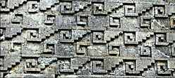
Now when you say Aztec to me the first thing I associate that with are their temples. Big tall
square temples made out of stone. More precisely large blocks of stone with patterns or designs engraved in them. My original idea was creating
a word mark that felt like it was carved into stone. In my mind that meant no smooth rounded Os or corners and no sharp long angles. When talking about a civilization that faded away some 500 years ago, I felt like whatever patterns, designs
or even typography that they had or could create needed to be simple and very geometric. Hence
no beautiful rounded Os or sharp Vs. Craving into
stone is no easy task so the simpler the better I figured. The other bit of inspiration I wanted to
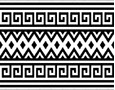
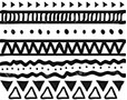
try and invoke were patterns. I didn’t have any specific inspiration in mind when it came to this
but I wanted it to feel tribal, playful with a
decorative feel to it.
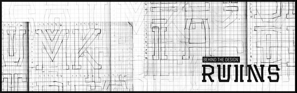
In the end I created these two word marks you
see below. These were the origins of what Ruins would be based off of.
There’s a lot of things I dig about these wordmarks. The double lines in the I’s and the T’s in my mind created this tribal, decorative, hypnotic feel to the letterforms. They
also created this interesting vertical rhythm to words.
Adding the bars to the top or bottom of the capital letters was another interesting turn of events. Not only did they mimic the double lines in the I and T but also created this bouncing baseline or rhythm horizontally. I kept playing
with those ideas with the inside of the O and U so you had
an overall rhythm to the letterforms. The wedge on the M
was another slight touch I thought brought a lot of
character to the overall aesthetic.
When I decided to actually revisit these wordmarks and
try to make it into an actual typeface, one thing I realized very early was I need consistent spacing to open up
all these elements. This way it ensured that even when
used at a smaller point size, the overall look and feel would still be communicated. Below you can see the original wordmark I had created and next to it the same two restaurant names typeset in the Ruins typeface.
For the lowercase I already established some rules and overall design aesthetics for the capitals. So it was just a matter of integrating what I had already established. But since the lowercase characters are traditionally used for large blocks of copy and to be read, pairing down some of the elements was necessary. So gone was adding a bar
to the top or bottom of characters. I figured adding double lines to lowercase letters like L or I would create too much confusion when trying to read blocks of copy. But I did find
a good use for that treatment in the lowercase X. Since traditionally the X has one thick stroke and one thin,
adding a double line to it seems to fit perfectly. Same can
be said about adding a wedge to the lowercase Y. For the rest, I treated them the same way I had for the capital O
and U. Filling in that negative area with a strong vertical element. Once again adding those elements to the
lowercase characters and seeing them in big blocks of
copy creates this really nice rhythm.
Now since this typeface has such a specific theme to
it (AKA Aztecan), it reminded me of some of my favorite typefaces when I was in school for graphic design. There were a few type foundries I loved as a young designer, Emigre and House Industry. Both have a
few typefaces with very strong personality. A classic example is Mason from Emigre. The fact that Jonathan Barnbrook made a serif and a san serif version of Mason was the kind of thing I love. If the devil ever needs a typeface for his or hers brand, freaking
Mason would be it. As for House Industry, well just about everyone of the typefaces has a story behind them. I always love that House Industry would make these crazy versions of the typefaces that would
work with the overall theme behind the design. What
I loved ever more was that they added all sorts of
extra glyphs or clip art inside their typefaces. So
with that in mind, I thought it would be really fun to make two additional styles of Ruins.
Since the original idea behind this typeface was what
if some Aztecans in the 1550s had to carve characters into stone. My idea was what would these letters look like after decades of wear and tear? So why not create a few versions of them breaking apart or being shattered. It's my little nod to some masters of
type design and big thank you for your inspiration.


